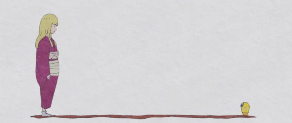
02.15 Flip book
·Reflection
what is successful about the “Flip book” ?
· The cat shook his head in the middle part that really cute. If do it again I want to add this action and make it longer than now.
what would you improve about that flip book? And how?
· The shot of the cat turning around is difficult to distinguish. If do it again I will try to zoom in on the character and use a white line to draw out the inner contour of the character.
· At the end part, the position of the cat is too close to the inside of the book, which is neither beautiful nor easy to flip and the whole flip book’s story is not strong, the ending is too hasty. Next time I will make a storyboard and some draft to enhance the story and make sure the position of the character.
02.16 Idea generation workshop
·Reflection
This is a good try for me, I still need to improve my colors. Although the color looks bright but has no characteristics. I should draw more color drafts and refer to the color schemes of illustrators which are I like, such as Holly Warburton. In the end part, the letter design also is a problem. They are too big to be distinguished. Next time I will try to make different words have different letter sizes.
Difference between two collections

My father’s collection (L) My collection (R)
· The left one was published in 1994, mine was published in 2014.
· The left one’s background color is gray, right one’s background color is white.
· The left one is about Baoshi Fu and his wash painting, the right one is about an early animated film in china “Havoc in Heaven”.
· The color on the left is simpler, the color on the right is brighter and colorful.
· The left one is a philatelic set which has a high collection value, It’s has a separate box to protect and it is easier to collect. The right one is stored in my notebook, it’s not easier to collect.
· The face value on the left is ten cents to one yuan, and the face value on the right is eighty cents to one yuan.
·The stamp on the left is upright, the stamp on the right is horizontal.
5 possible ideas
· Hang the collected photos of the sky on the ceiling.
· Use the collected sugar paper to form a pattern
· Put the bottles in the cupboard by type
·Take photos of the collections of the same color, Put them into a picture and stick them on the wall.
· Mount the stamps and flower specimens in a glass plate and stand up for viewing.
One thing
· Reflection
·What is successful about this drawing?
The “color” and the “form” are successful. The former is a good record of the color of the petals and the latter is a good record of its form.
·What would you improve about that drawing?
I want to improve the “outline” part. Next time I will adjust their size so that they can better compose patterns.
· Haring Animation
·Reflection
I really like this puppy’s color and this background. But if do it again I want to add more animal. It looks too monotonous if only have a puppy.